
NORTH V SOUTH
Branding
What started as a group of friends playing five-a-side for charity is now the UK’s biggest charity relay race event, raising over £60,000 every year.
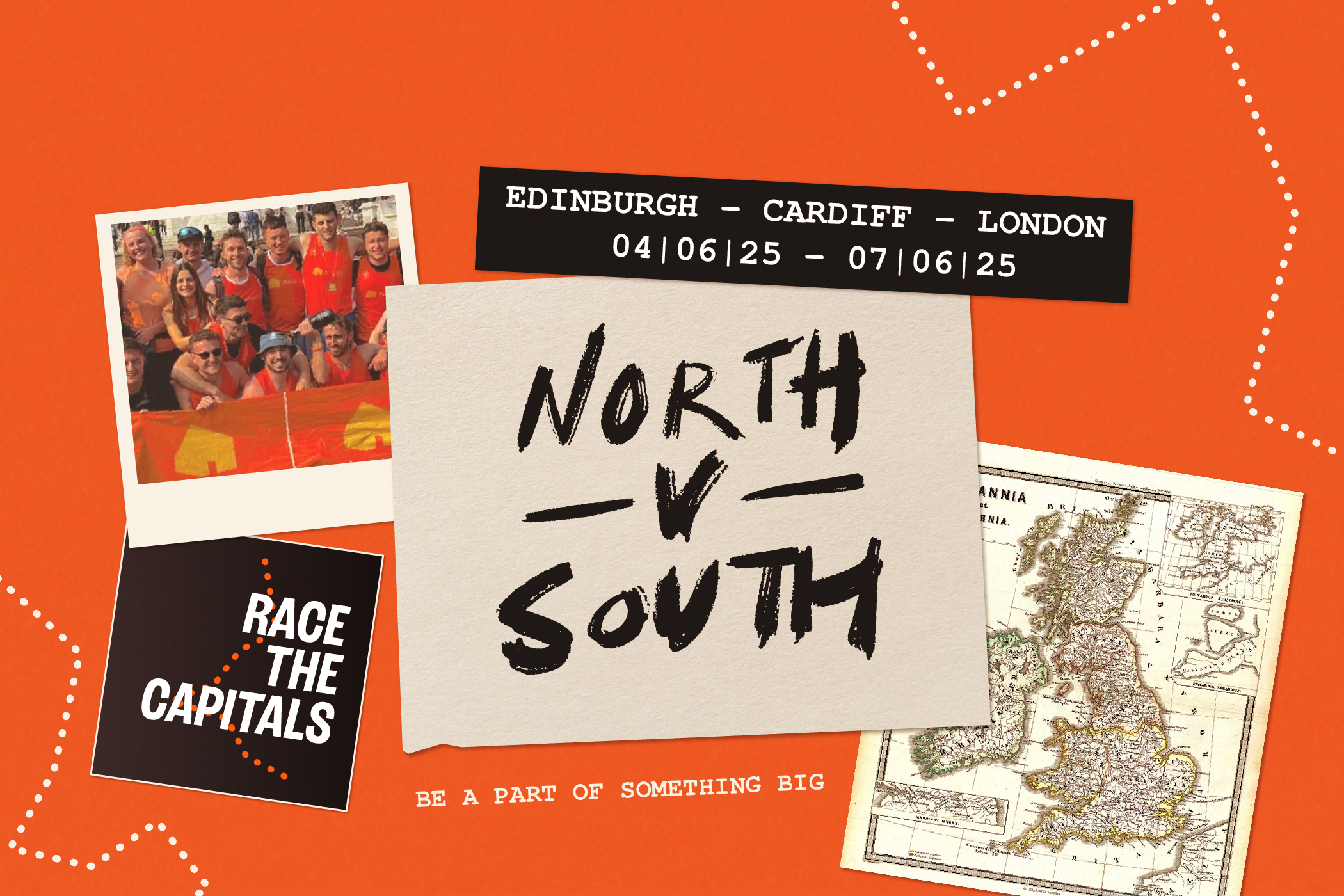
After working with me on a separate project, the team quickly realised the North v South branding could be pushed into a much more expansive and engaging design system. The essence of North v South is its authenticity. That’s where the design started: a scrapbook-style aesthetic, a hand-written custom wordmark, and a visual language that feels human.
The refresh also introduced a flexible identity system for their events. The overarching North v South brand anchors everything, while individual events, like Race the Capitals, have their own stamp, ready to change for future races. Every element was conceived to grow with the community, without ever losing its personal, grassroots character.

Before
After


Credits
Photography - North V South